Crafting Bold, Impactful Brands That Connect & Convert
Vance Street Capital is a LA-based private equity firm and the partner of choice for entrepreneurs in b2b, middle market, precision manufacturing companies who provide highly engineered solutions for blue chip customers.


project details
Vance Street Capital approached MPW about a brand refresh and new website. Their previous website was designed using a cookie-cutter template similar to other venture capital firms; Vance wanted to stand out from the crowd and have a website that they could really make their own. They were looking for a modern, fresh brand to match the marketplace that Vance had evolved into. They wanted to step away from company and product-based presentations to place a larger focus on the impact they bring as partners. They were looking for a bold, contemporary, confident, yet approachable look and feel that translates to their company culture and would appeal to entrepreneurs and investors alike.
results
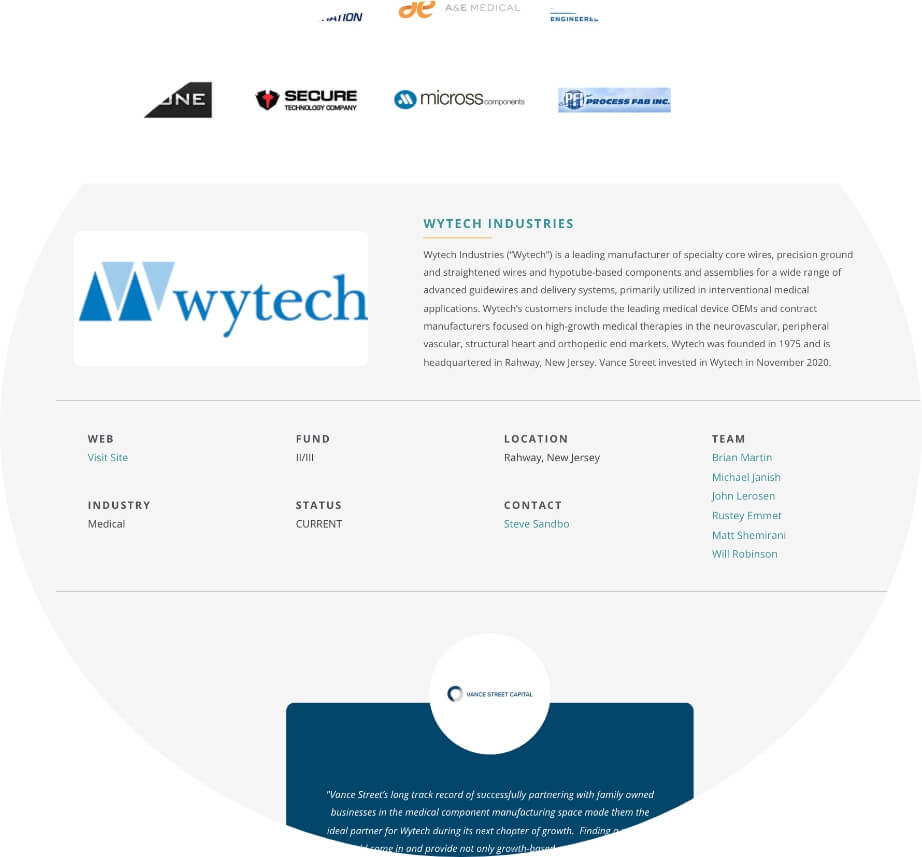
We developed a brand and website that did just that. With bold new colors, persuasive messaging focused on their philosophy, the ways that they differ from other venture capital firms, their capabilities, and their portfolio companies. We highlighted the team members that have been instrumental to each partnership, and added trust elements, including written and video testimonials from portfolio companies.
challenge & deliverables
Vance Street Capital really has two audiences. The primary audience for out-going communication is entrepreneurs / owners, which will drive the overall Vance Street Capital brand. The secondary audience is investors. Because the investor audience has different interests and desires than the owner/entrepreneur, specific messaging targeting this group needed to employ a different tone and approach than that of primary messaging.
One of the larger challenges was trying to be “edgy” with the site while keeping it professional. We tried different color combinations and palettes on the website to give the client a fresh look. Another challenge was trying to tie in their portfolio companies and team members so that they all functioned together. We accomplished this by providing content from the portfolio companies that showed which team members were part of each one, as well as having each Vance Street team member’s bio show their portfolio of companies they’ve worked on.

It was vital that we walked the client through the branding process to ensure it was right for them and they were pleased with the end result. We took the time to finesse the brand to its full potential during that process and not in hindsight. We truly want what is best for our clients and what fits the strategic goals of the brand vision, aesthetics and personality, and we accomplished this with Vance Street.