Check out these buns.
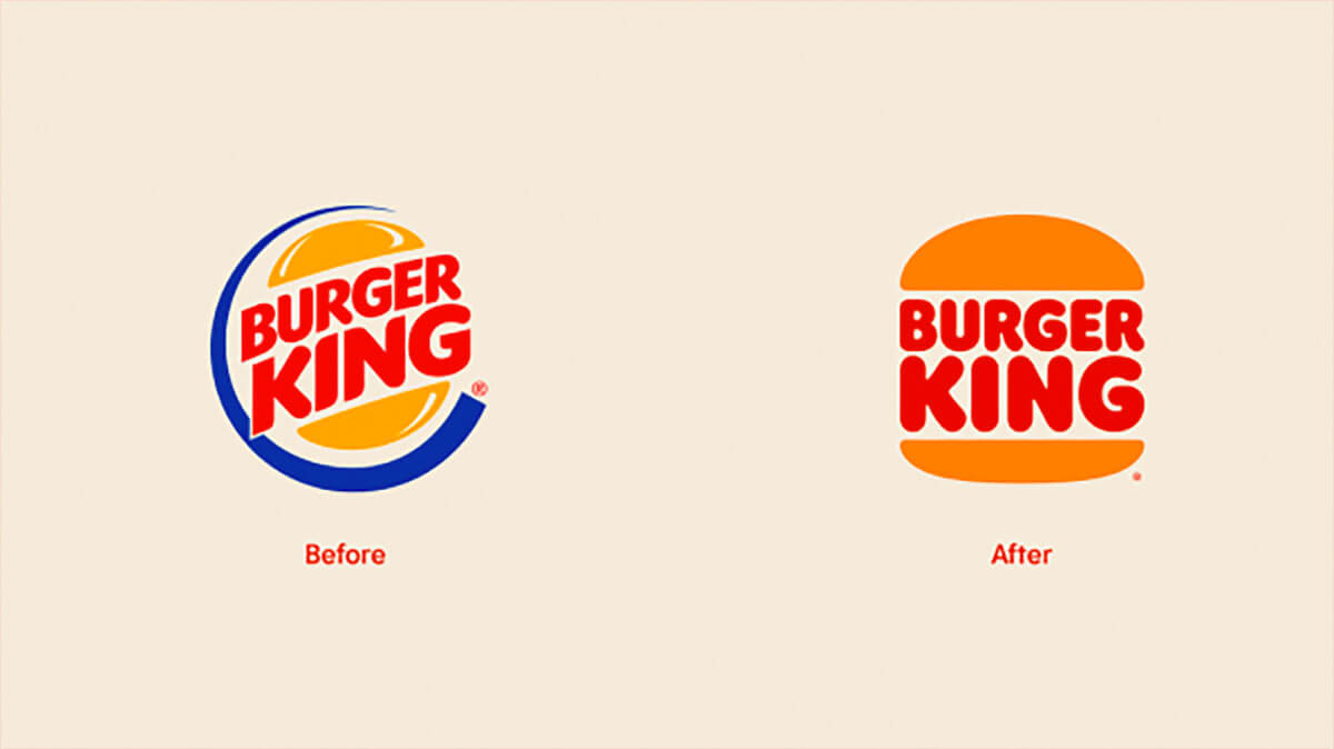
With lots of hype surrounding Burger King’s latest rebrand, how could one not step back and take a closer look as this evolutionary change? Those buns were 20 years old, so it’s no surprise they’ve now gone flat, friends – albeit in a sophisticated, bold way.
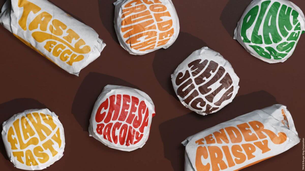
How about this custom-made font appropriately named “Flame”? I mean come on!
While I’m not a fast food lover of sorts, I cannot deny wanting to experience this new set of playfulness that has been not only been integrated into packaging (that font just makes it look oh-so-good), but carries over into uniforms and the overall experience from drive-thru to restaurant interior.
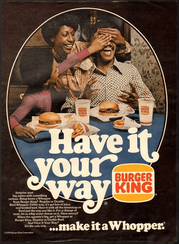
It’s also interesting to note, there is something a little bit old in what’s new again when it comes to Burger King’s rebrand. Gen Xer’s may find that they have a fondness for those new buns – and that may be because, in part, that they’re reminiscent of the buns in the BK logo from their childhood. While the logo and font treatments aren’t entirely the same, there’s no doubt that the rebranding may just bring up some fond fast food memories for the latchkey generation.
Overall, props to Burger King for a thoughtful re-brand that changes not only how people may feel about their brand and the experience, but how stepping outside of the (cardboard burger) box, while respecting the Burger King of the past, can really pay off.
If you really want a blast from past, where did the Burger King mascot go?


